 |
| Click on image to see larger version. Image courtesy of American Addiction Centers |
At this time of year, I like to look back and consider what really grabbed my attention. In the addiction treatment and behavioral healthcare community, vendors of all stripes are sharing thousands of marketing messages to engage professionals. Many accomplish their objectives, but occasionally a campaign, ad, offer, or other marketing technique makes me stop and admire the marketers' handiwork.
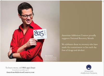
I had such a reaction with the above ad, which is running in the Addiction
Professional/Behavioral Healthcare annual calendar, mailing with the November/December
2013 issues. The ad, designed by Hiawatha Walker at American Addiction Centers, is featured in
September and recognizes National Recovery Month.
I am impressed by this ad for several reasons. Most notably, I am delighted
that it celebrates the recovery of one of AAC’s staff members. The photo is of
Ben Hoback, an alumni concierge manager, celebrating "825 days and
counting" of recovery. All too often marketers use stock photography (aka
"clip art") in their collateral, and it's usually easy to spot that
such images don't represent "real" people (or, more accurately, people
really connected to the product or service being advertised).
I frequently encourage clients to feature actual patients or staff in
their marketing messages. Those who do often turn to their head clinician to
spotlight, but this is the first ad in recent memory featuring a "frontline"
staff member. And that sort of recognition of those in the trenches day in and
day out speaks volumes.
Plus, this ad adheres to my golden rule of marketing: "Know thy
audience." This calendar is distributed to field professionals. Highlighting
someone from their peer group is a wise tactic. Of course, AAC could have also
highlighted a patient or family member, but recognizing a staff member provides
a "behind-the-scenes" message that personnel matter to the
organization's mission.
From a design perspective, the ad demonstrates an elegant balance of
color and text. Ben's shirt provides an eye-catching pop, and the relatively
subtle text is appropriate to the messaging. AAC’s logo is in a well-placed
position (bottom right), providing a subdued yet clear branding message.
One suggestion I have is that AAC might have considered making the text
in the bottom left a bit more relevant to the professional audience, such as
"To learn how we can partner with you on your patients' recovery,
call...." Yet overall this is an elegant demonstration of an effective branding
message. For that reason I name it one of my personal favorites for 2013.

